France
2025
UX/UI design of a mobile app

Project scope
Over a year of ongoing collaboration
The collaboration began with a short trial assignment for 5 screens. After it was completed, the client decided to continue — since then, the project has been ongoing without interruption, with the scope and budget regularly expanding.
The only designer on the product team
Since the beginning of our collaboration, I have been responsible for the entire UX/UI design of the app — from redesigning existing screens, through new features, to the component system and marketing materials.
From redesign to new features
The scope of our collaboration gradually expanded: from adapting the old screens to the new visual style, through designing new game modes, to independently proposing UX improvements that influenced product development.

Overview/
Tweener: long-term UX/UI collaboration on a fantasy tennis app

Business Needs/
Business needs and project goals
Problems and solutions
Problem
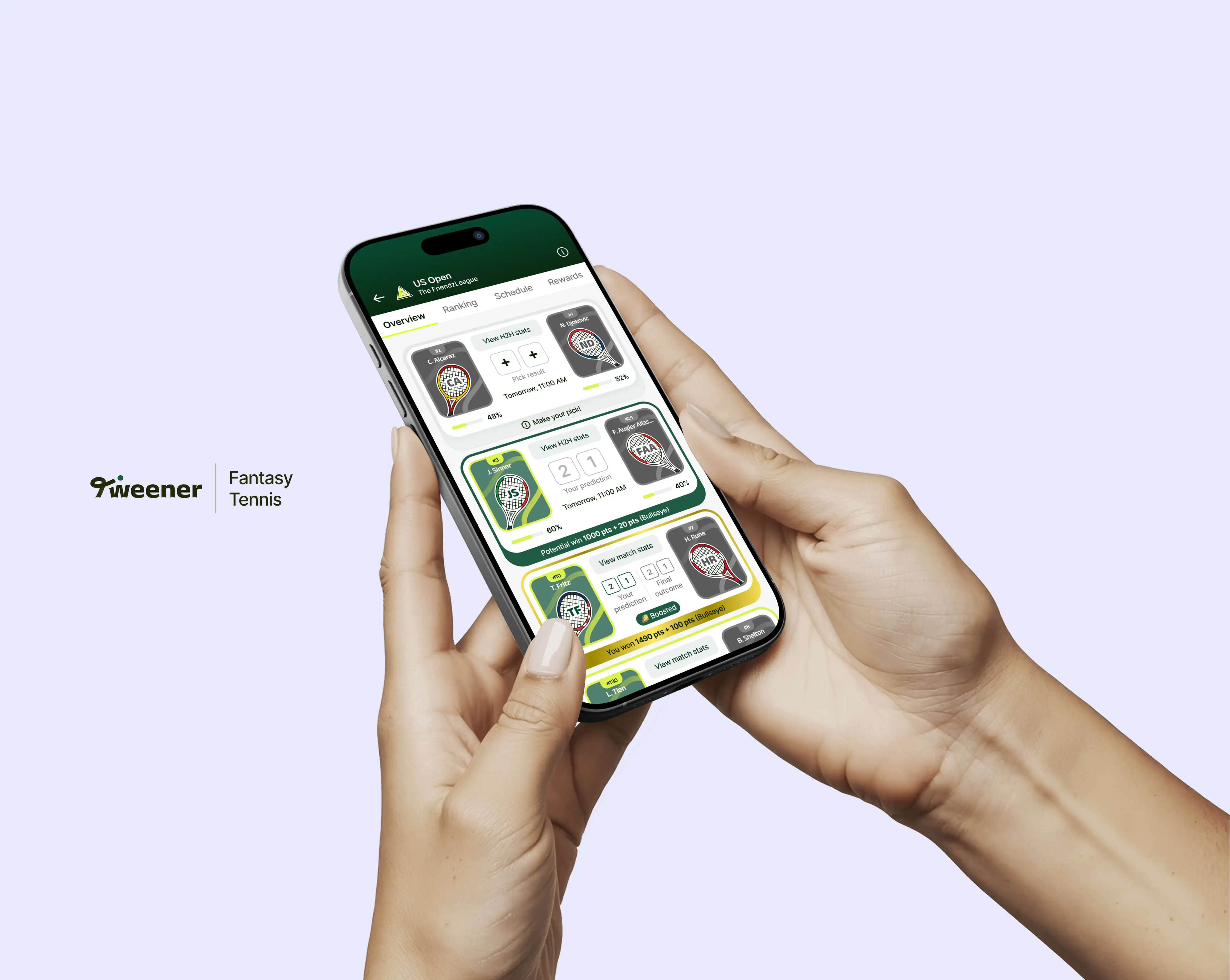
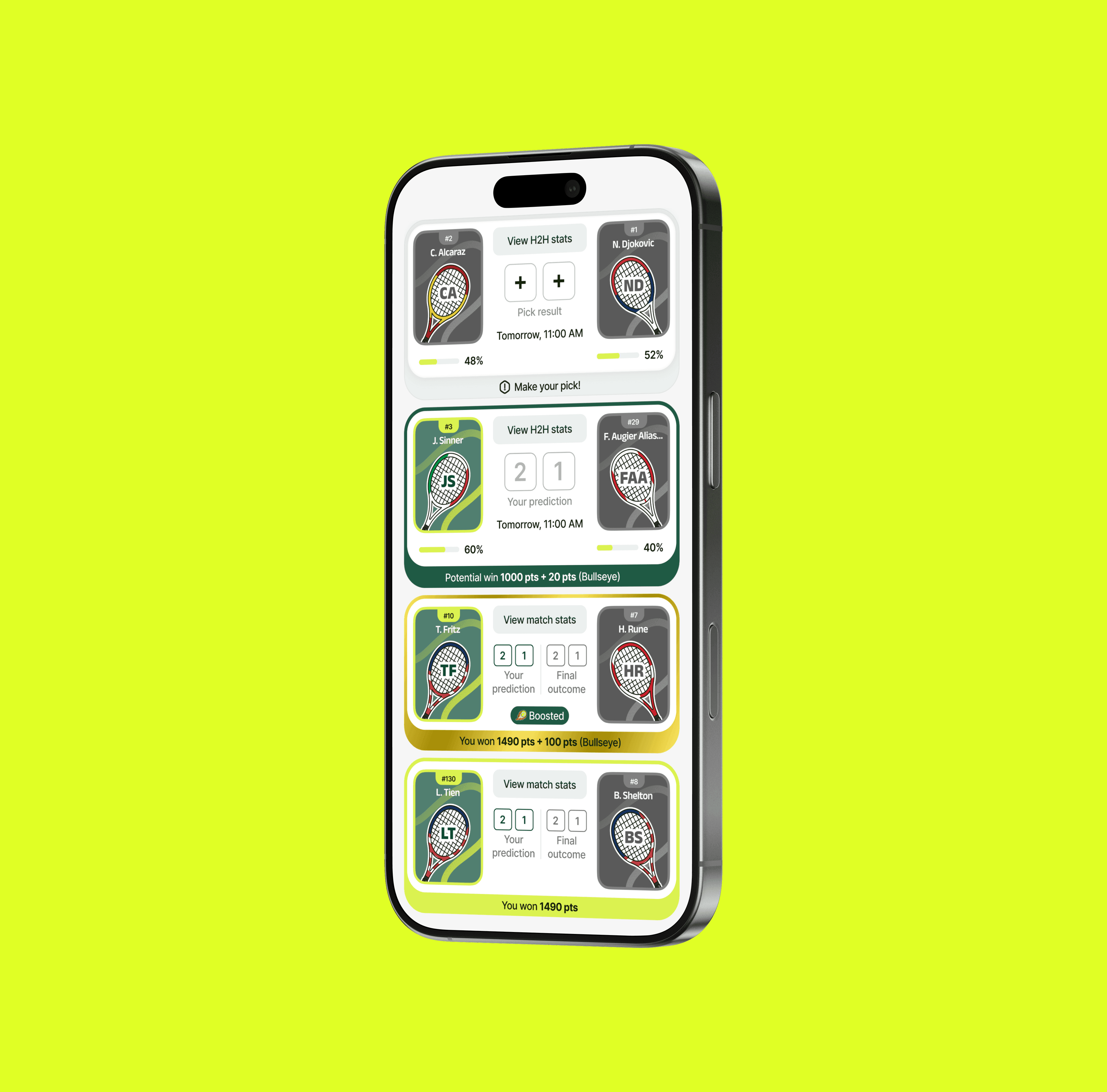
The application had about 40 screens in the old visual style that needed to be moved to the new visual direction — without losing functionality and while maintaining consistency across all screens.
Solution
Instead of simply "carrying over" the graphics, a system of components and reusable UI elements was built, which makes it possible to create new screens faster and implement changes more easily in the future. This approach was appreciated by the client and adopted as the standard for future work.
Problem
As the product evolved, there was a need to design a completely new game mode with support for payments, deposits, and availability conditions depending on the user’s country — an area that requires particular care in UX.
A complete flow for the new mode has been designed, taking into account different availability states, payment logic, and clear communication of the terms. The entire process has been prepared in a separate Figma file, ready to be handed over to developers.
Problem
Dense and information-heavy app screens—such as standings tables, league cards, or player selection screens—made it difficult for users to quickly understand information and make decisions.
Solution
The information hierarchy on key screens was redesigned, simplifying the structure and improving readability without removing functionality. Clarity of communication was the priority—especially important in a context where users make quick decisions.